Sky News Arabia
A complete Overhaul of Region’s Premium News Portal
SkyNews Arabia is one of region’s the most popular Arabic News Channel and portal.
After RBBi’s initial engagement where the portal was put through the usability testing in 2012, SkyNews
Arabia team again invited RBBi in early 2015 to work on the complete re-design of the portal. The focus
was simply to overhaul the way portal was structured, news was consumed by redefining the user
experience.
Understanding & Analysing
As our first step, we conducted a series of workshops with all internal stakeholders to
understand the insights from the business, data/analytics, current workflow, technology stack
and most importantly the pain points identified by the team at SNA.
These workshops also involved brainstorming sessions to discuss ideas and possible impact on the
workflow.

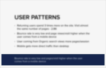
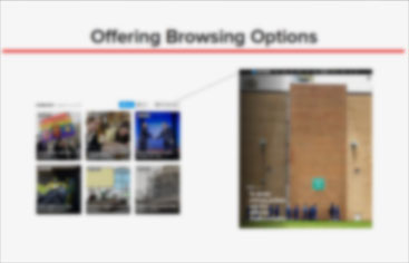
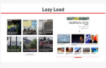
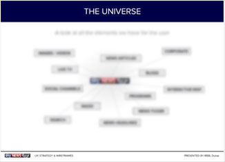
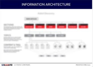
Sky News Arabia UX Strategy
We started with a mission to change the way region looks at news specially the
Arabic readers. The average user experience standards for news browsing for Arabic portals needed to be
challenged. However, it wasn’t all chaos. No feature was added for the sake of it. The whole experience
was built on a strong foundation of the overall UX strategy.
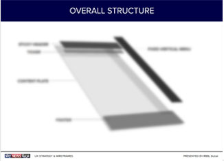
From Scribbles to Annotated Wireframes
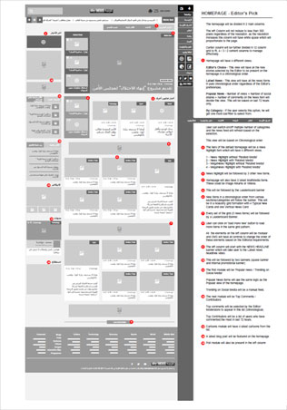
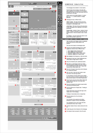
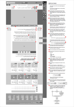
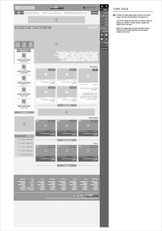
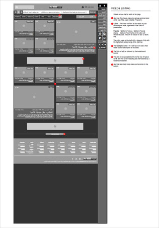
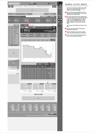
Our scope covered final annotated wireframes for the responsive framework of the portal.
These started with simple scribbles on paper and evolved in to final pixel perfect wireframes to be
delivered to the SkyNew Arabia’s internal design team for implementation. The whole approach was ‘Mobile
First’ as the discovery phase showed the need for it.
Prototype Testing with Users
Preparing wireframes and navigation strategy is just one side of the coin. At RBBi, the project
is never complete till we involve the users to co-create.
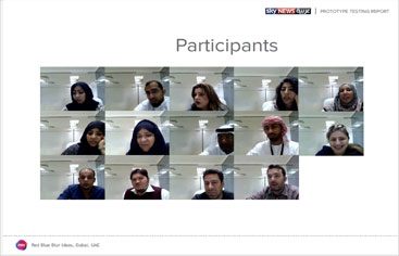
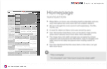
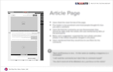
We tested a wireframe prototype with our real users to understand if we have understood their
behaviour and if we have translated it in to a seamless user experience.

The ‘Mobile First’ Approach
The biggest misconception about this approach is – You need to start designing the mobile
version first. Yes and No. Mobile First approach requires you to think mobile and not just start
designing from it. Every aspect of the SNA portal was thought through with this approach. Decisions were
made, elements were rejected and worked upon again and again with this approach.
Few Highlights
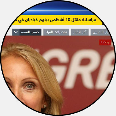
Freedom to Users
Ability to view news by Time, Category and Editor’s
Choice gives users freedom to customize the feed as per their taste.
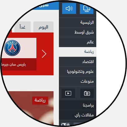
Fixed Main Navigation
Looking at the Mobile-First approach and current
trends we opted for a fixed side navigation with mega-dropdowns to avoid multiple clicks.
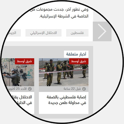
Discovery of Articles
The article page has various paths for users to guide
them to discover relevant content and thus increasing the engagement.
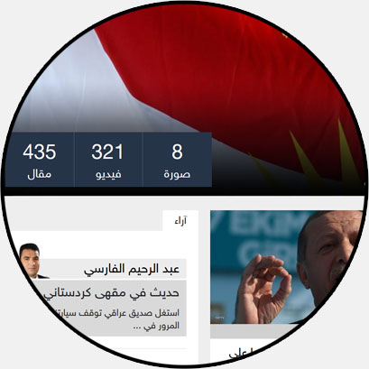
Topic Pages
We introduced Topic Pages to help specific users find
all relevant content across various content types in one place.
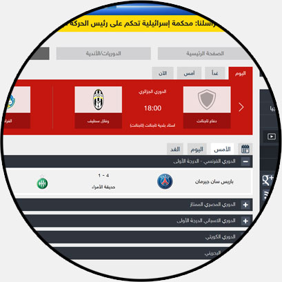
Engaging Sports Page
One of the most visited area for any news portal is
sports. We treated it care keeping in mind Sport Fan’s point view and things that they love
to see.
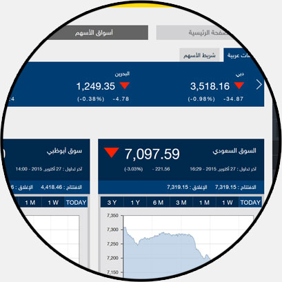
The Business
Similarly the business section was structured looking
at the primary objectives and visual hierarchy for user relevance.

Thair Soukar
Head of Digital Strategy, SkyNews Arabia
This key project was preceded by a couple of minor ones we had done with RBBI. Our relationship with them
is a true form of business partnership at its best. They wholeheartedly love what they do; and it does
show. The sheer passion that drives them, along with their diligence, veracity & attention to
details have earned them our lasting trust. The company enjoys such an entrepreneurial spirit, and every
time I step into their “white office”, I leave loaded with lots of positive energy!
