RTA UX Review
Usability Audit and UI Enhancements for 4 Popular RTA Apps
RTA and RBBi teamed up first time on this project to review four of the most popular
apps that RTA has. RBBi’s role was to understand these apps and look at these from a end user’s
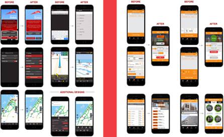
perspective. Objective was to achieve quick wins by addressing glaring usability issues, cleaning up the
interface in terms of usability, iconography, and task optimization without affecting the overall
functionality of the app.
Analysing the data and ratings
It was time to get real users involved. We got a mix of demographics based on the
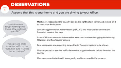
app usage to come to our Usability Lab and use these apps. These participants, were given real tasks to
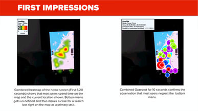
perform on these apps while we used Eyetracking and Cognitive Walkthrough methods to get user insights.
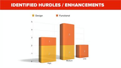
The test data along with heatmaps was analysed for user patterns and usability hurdles. Expert review
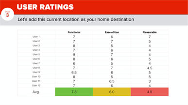
discovered gaps in heuristic standards. User ratings and insights were documented.
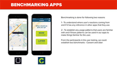
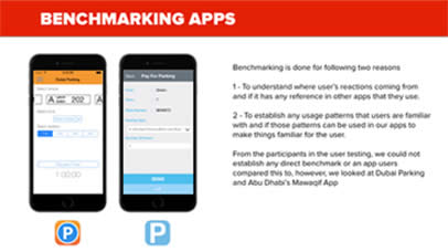
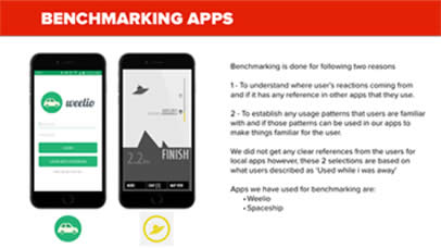
Benchmarking User Behaviour
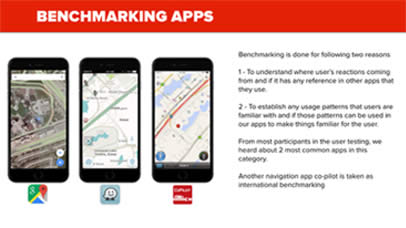
Users are used to certain labels, icons, features, user journeys and patterns across various apps with
similar features and functionality. One of the aims was to to explore and understood these patterns to
avoid reinventing the wheel and provide user’s an experience which depends more on recognition that
recall.
