FoodFood
Bringing the Channel Online
A TV channel run by Indian celebrity chef, Sanjiv Kapoor. RBBi got awarded this
project to design and develop the portal after an international pitch process. The Master Chef was
personally involved in making the decision after looking at the strategy, design and the user experience
which was presented by RBBi
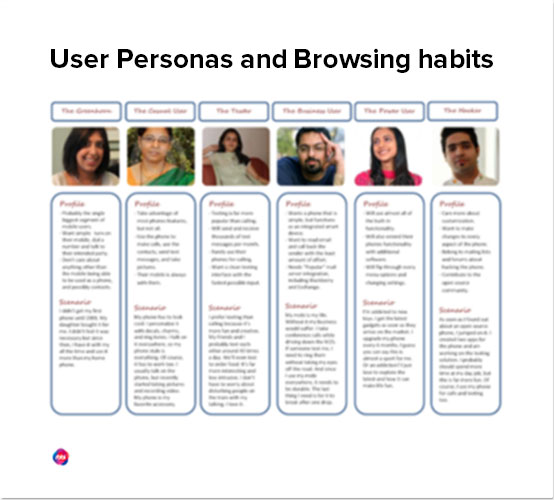
Insights and user journeys
The task was to talk to foodies and everybody
who seeks recipes and/or
interested in the art of making taste buds tingle.
RBBi depended on third party research and
Chef Sanjeev Kapoor himself with his wealth of
knowledge and insights about various user
personas.
How they browse, what do they seek? how do
they filter or search? Do they
use desktop, tablet or mobiles? Do they need to
login? etc. etc. Final User Personas had all
those insights built in to consideration for us to
start the next phase – Design.
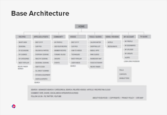
Information Architecture & Wireframes
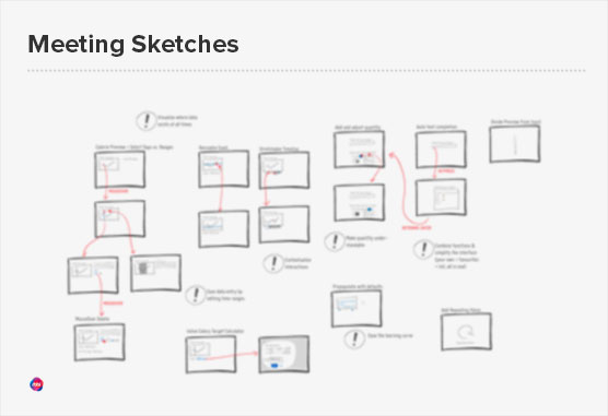
Getting started on paper.
That’s the way we roll
After spending time with Mr. Sanjeev Kapoor and the Food Food team,
discussing and planning the overall approach. The challenge was to put these insights in
perspective and find ways to bring out the most relevant information needed by the users. The
web has become multi dimensional and we wanted to take advantage of that leap but at the same time keeping in mind the avg. user and limitations caused
by their browsing patterns.
Some of the insights we got were against the common concepts and were
challenging to the core concept of how users browse food recipes and videos.
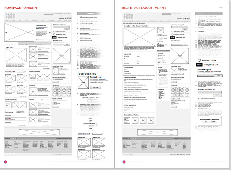
Annotated Wireframes
Some client call it B/W designs. Wireframes are the blueprints of design. We
created all user journeys through these wireframes and then tested these with actual users, using a
method called Paper Prototyping. This helped us define the page structure and allow design to
concentrate on bringing the experience to life visually without worrying about what should or
shouldn’t be on the page.
The Juicy User Interface Details
After weeks of design cycles and successful client approvals, RBBi delivered
final designs for every page, every component and every element—with all it’s juicy details, all
down to a pixel perfect layered file to the development team.

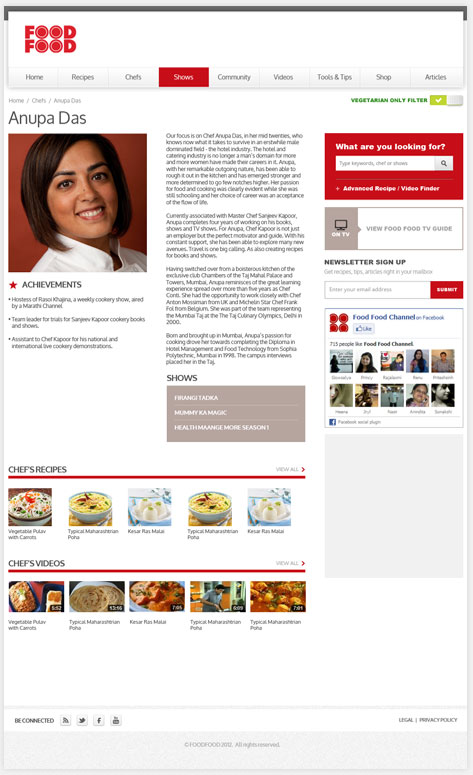
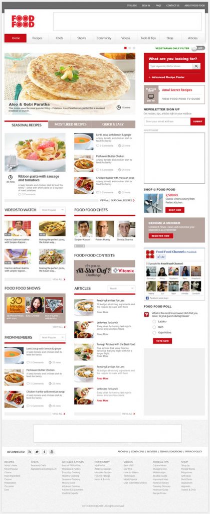
Informed design is the mantra we follow at RBBi. Here a classic example. Based
our research and client’s insights we learnt that from the audience who look for recipes, tips and
suggestions online around 68-70 percent are vegetarians (from the Food Food TA). That gave us an
inspiration to put this one click filter to convert the entire site’s content in to vegetarian only.
Using the content as the hero.
That’s what we follow.
Good interface is the one that facilitate user’s interaction with the
content without becoming a distraction in itself.- A thought that drives every designer at RBBi.
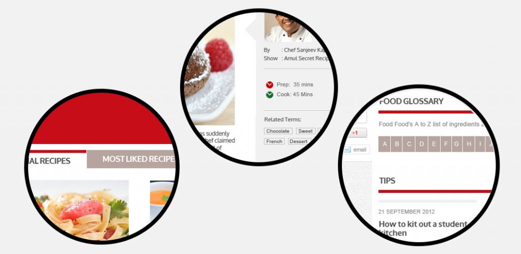
Entire website UI creafted built using just 2-3 colours from the brand
palette to create this minimalistic look that highlighted beautiful imagery and the content of
the website.
Recipes Homepage
A starting page for most of the user journeys
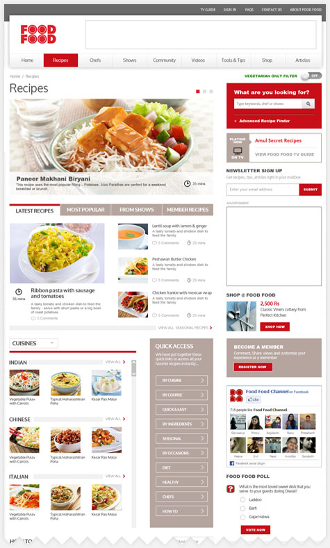
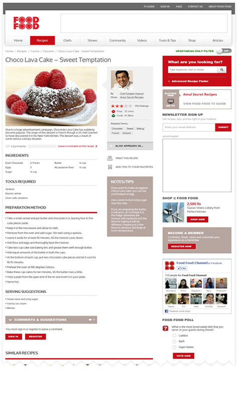
Recipes recipes
The final destination page and begining of the conversation.
Recipe / Video Finder

Chef’s Details
