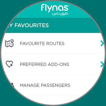
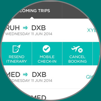
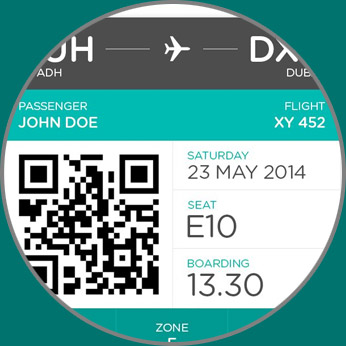
Flynas
A Digital Facelift For Flynas
flynas is a leading low-cost carrier from Saudi Arabia, operating nearly 950 weekly
flights on 25 destinations within and outside of Saudi Arabia. Launched in 2007, flynas unveiled a new
modern identity in 2013 to keep up with consumers and their needs.
As part of their makeover, flynas contracted RBBi to give them a new digital image.
It was a complete overhaul of it’s online presence and User Experience
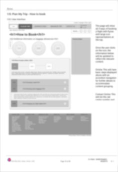
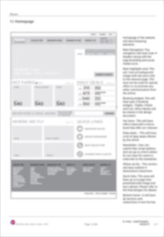
Architecture and UX Strategy
The most important part of this project was the Information
Architecture. When you understand
user’s needs and take the best practices in to consideration, you
can come up with an
architecture that caters to both business goals and user needs.
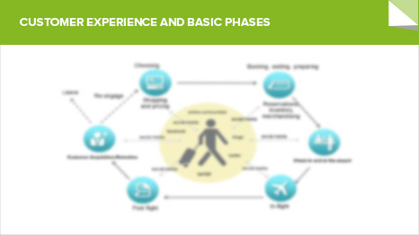
We broke down the information three basic needs for the user.
Plan, Book and Manage. Every
section with the information that is required in that phase of travel.
UI Design
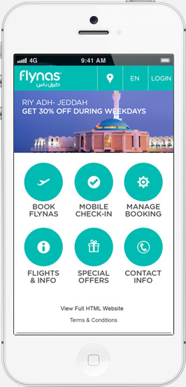
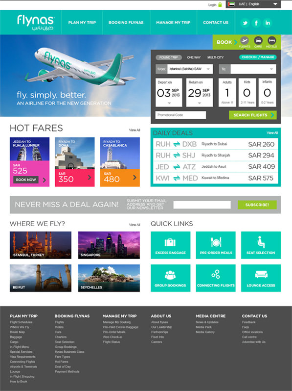
The final UI design for both desktop and mobile sites was prepared based
today’s trends, user behaviour patterns and most importantly ease of use (usability best
practices).
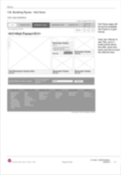
The Booking Engine
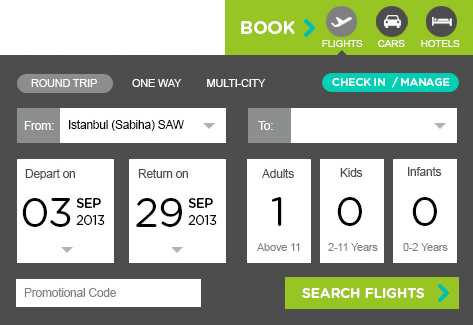
At the heart of every airline website is it’s booking engine. The bottom line is if you can’t get it
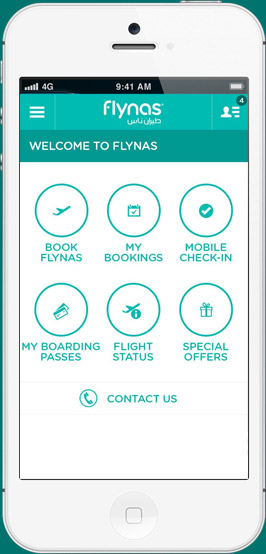
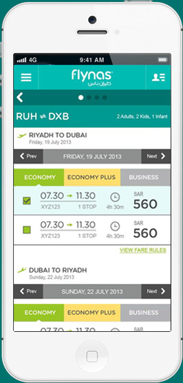
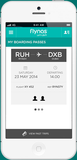
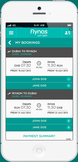
right you can’t make the cut. flynas booking engine was carefully designed for desktop, tablets and
moble devices. With touch-friendly buttons, intiuative field labels and pixel perfect visual hierarchy
optimized for ease of use and overall usability.
