ADIB Phone Banking
Mobile Banking For Today’s Generation
Banking On iPhone
No it’s not new. But when Abu Dhabi Islamic Bank decided to come up with their
iPhone banking app, they wanted to keep it relevant to the users. They turned to RBBi to work with their
technology partner to bring this to life.
Our Role
RBBi’s responsibility was to plan the app it’s user journey and finally design
the user interface for it. The technology partner was assigned to translate these designs in to an
app using ADIB’s core banking interface.
Planning & UX
We wanted to understand that tasks users would perform while they use online
banking app or any other banking app for that
matter. Once we got that we then sat with the
bank
to understand the areas they want to focus.
So, the alignment between these two things
brought us to the drawing board
to put these in a structure. How many steps
would the task take? How do we push marketing
messages? These are and many more questions
were needed to be tackled.

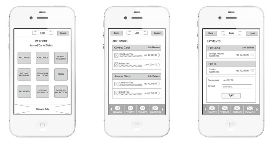
Wireframes
Before starting with the designs, we carefully map out all of the content, and
define the most critical component: Wireframes. The experience revolved around a seamless experience
compared to the internet banking that users’s were already using. So we focused on simplifiying it and
still keeping it relevant.
Iconography
After trying various navigation models, and doing tests with users, the team
settled with icon style navigation iPhone users are used to. Now the challenge was to design
simple and easy to remember icons for each banking task available in the app.
Details
Retina ready high resolution icons

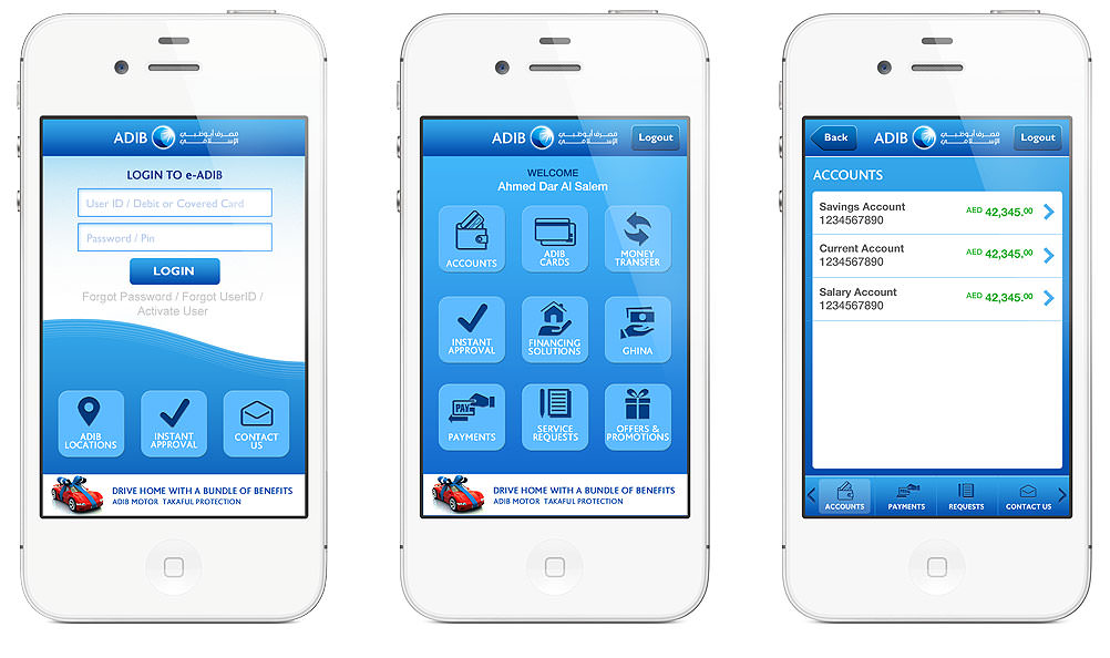
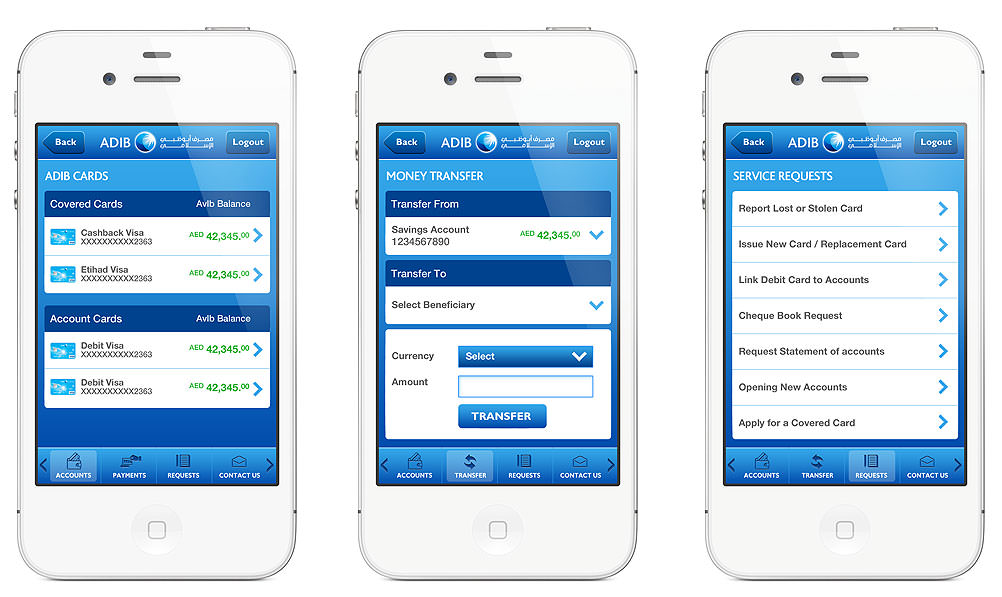
The Final Touch of Skin and Colors
The last step for us was to translate those wireframes from
physical sketches to
digital space. So the designs for the app absorbed the
look and feel of ADIB’s brand philosophy,
then refined and extended it to carry through a clean,
sophisticated visual experience.
