In the recent past, we’ve spotted several eye-tracking studies on international print ads which shed light on the consumer perception of the ads.
With the launch of our new Usability Lab recently, an excited bunch of us tried to test out gaze patterns and conduct eye-tracking on some popular print ads from the region (source: www.adsoftheworlds.com) to gain some insights on how consumers perceive the ads.
We all are well aware of our attention quotient on ads as we flip through pages of a magazine or read the newspaper. To quench our curiosity, we decided to test a few hand-picked ads with 40 random people. We exposed them to each ad for a span of 8 seconds in order to learn what they notice and where do they spend most of that time on the ad. We were also curious to see if there was a significant difference in the perception of these ads between male & female participants.
The results were really interesting, to say the least.
Overall observations are that although these ads vary in colours and visuals, at the end of the day all these are shapes and forms that lead the participant’s eye movement. Depending on the shape, element and basic principles of design, a good ad can drive its onlooker to make them see what it really wants them to see, thus driving the message home.
Some of the key findings we uncovered:
- People spend very little time looking at the logo/brand
- They do read ad copy but only if the ad is aesthetically & visually intriguing
- Female and Male users have a different point of view (No surprises there!)
See for yourself:
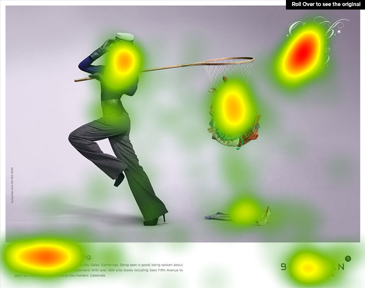
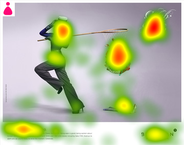
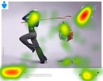
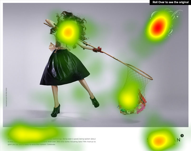
Note how females look at all the accessories carefully. Whereas males are spending time on the headline.
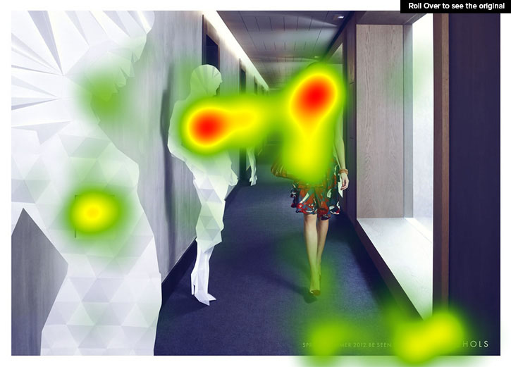
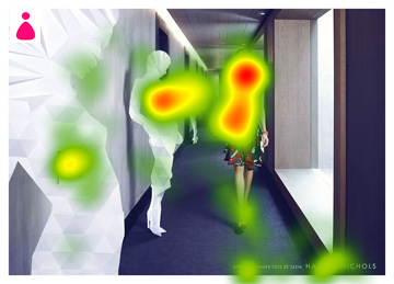
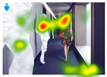
Note how females look at all the accessories carefully. Whereas males are spending time on the headline.

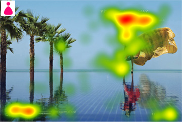

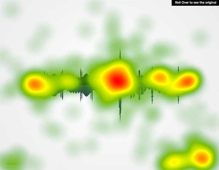
Females spent more time on the headline. But they haven’t forgotten to notice the shoe.
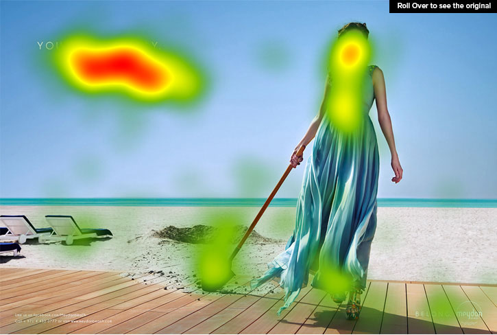


Females seem to be more organised here, they seem to know where they want to look. We cannot figure out what’s so interesting about the spade for Males though.
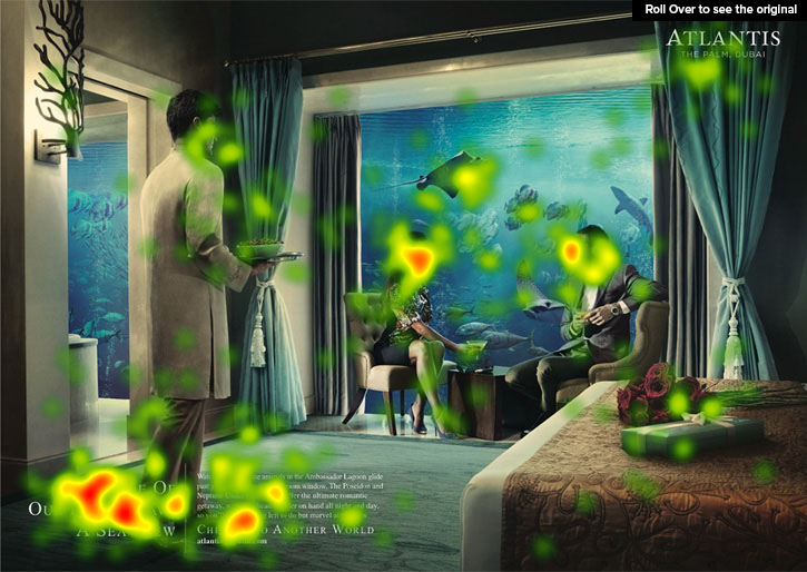
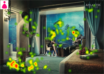
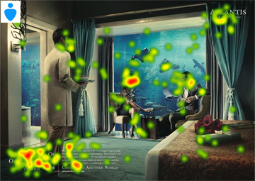
It’s only natural that males and females like to look at their opposite sex but notice how males have just few random places to look at in this ad.

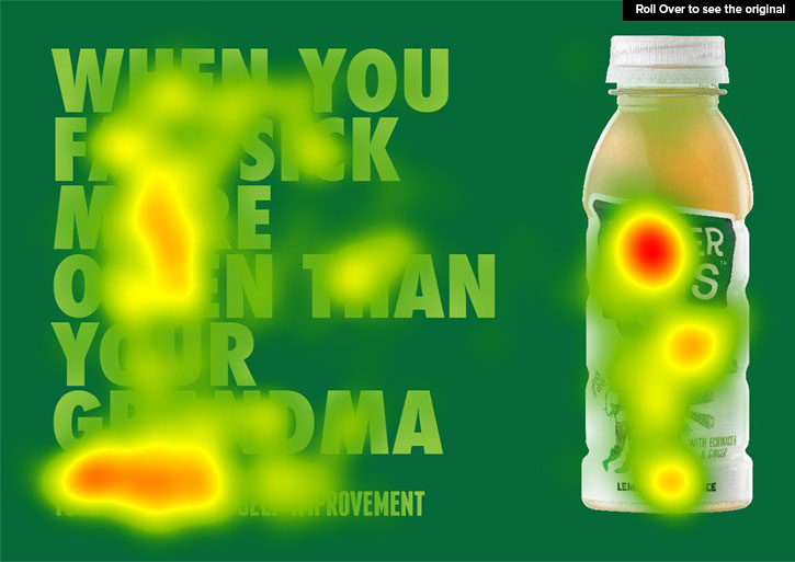

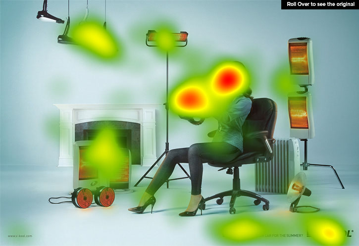
Sorry, but we had to use this one after all the storm it created on social media. Remember the original ad?


