With all the buzz around Google launching its mobile-first index and its increasing focus on enhancing the search experience for mobile users, we have reached a time where optimizing websites for mobile is no longer optional, but a mandatory step to keep up with digital transformation.
Here are five Mobile SEO tricks you can do to boost the visibility of your website for mobile users:
Optimize page speed

Nothing is more frustrating than opening a webpage on your mobile phone and staring at a white blank page while waiting for it to load, wondering if your precious mobile data packets are melting away.
A research from QuBit have shown that Online retailers lose an estimated $1.73 Billions in global sales due to slow loading speeds. Lots of money on the line here!
So optimizing your page loading speed is not only about improving the user experience on your site but it also directly affects your conversion rates.
You can test your website speed and find out what are the issues that are causing your pages to load slower by using a tool from Google called Page Speed Insights.
Configure Viewport
Do you by any chance know how a website contents appear correctly on different platforms (Mobiles,Tablets…etc)?
Well, the answer is not “Magic!”. This kind of content display is defined by a small bit of code that you put into the header of your HTML called “ Viewport “.
Viewport is the window in which the content of a web page is seen, and by configuring it we define how big a window should be, which helps users in the end to see your website’s content properly on screens of different sizes.
Making sure your Viewport is configured correctly is quite important, or else your web page might not be mobile friendly. If the content doesn’t fit the screen and users need to scroll right and left to read it, your website loses a lot on the user experience and digital engagement front
Here’s what a viewport looks like:
Take a look at Google’s guide for Configuring Viewport to know how you can implement the Viewport.
Optimize for Rich Snippets

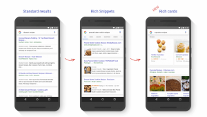
Have you ever wondered how come some of the results on the SERPs look cooler than the other with all their fancy images, ratings.. and such?
A well-structured rich snippet will be an eye catcher for users, encouraging them to click on the link, and allowing them to judge directly from the search results if a certain result is the one they are looking for.
Here’s some tools to help get the rich snippets:
- Google Data Highlighter: To markup the information you want to appear in the SERPs.
- Structured Data Testing Tool: Allows you to develop, test and modify the structured data markup.
Avoid Interstitials

Maybe at some point in the very distant past, you thought that having a mobile pop-up that suddenly fills the whole screen is such an awesome idea to catch your customer attention. However, let’s say it, POP-Ups are so annoying.
I have Google to back me up on this one, as recently they announced that starting from January 2017 any website that has pop-ups that completely cover the screen will get penalised, so you better remove any if you still have them to avoid losing rankings.
Optimise your content for mobile users
![]() The behaviour of desktop users is quite different from those on mobile, so in-order to make sure you give your mobile users the ultimate experience on your website, here’s a few things to take into consideration:
The behaviour of desktop users is quite different from those on mobile, so in-order to make sure you give your mobile users the ultimate experience on your website, here’s a few things to take into consideration:
Eliminate flash content: Flash components are incompatible with mobile devices, so all of your flash based components will not show to your mobile visitor.
• Keep your text short and simple: Since mobile devices comes in small screens and give you few square inches of are to view the content, it makes it harder for mobile users to view long textual content and they might even lose patience when they have to scroll many times to view the entire content, therefor consider keeping your content short and straight to the point.
• Reduce the size of images: Mobile screens do not offer the same resolution as desktops, and because the mobile screens all are small in size, all your high-resolution images will be resized to fit the mobile screen which might negatively impact the quality of the images.
Make sure to optimize your images by using reasonable sized images and avoid including too many high-resolution images that will make the process of loading the page on a mobile device a lot slower than the usual.
Overall, mobile use is growing at a fast pace, and Google will continue to make changes to optimize the search mobile experience. It is important to make sure your mobile site is optimized and provides the best user experience possible.


